Better.co.uk
Rebrand & Design System Under Pressure
Led a full website rebrand and design system build under a 4-week compressed deadline, as the sole design resource — while also securing investment in user testing that changed how the team made product decisions.
Context
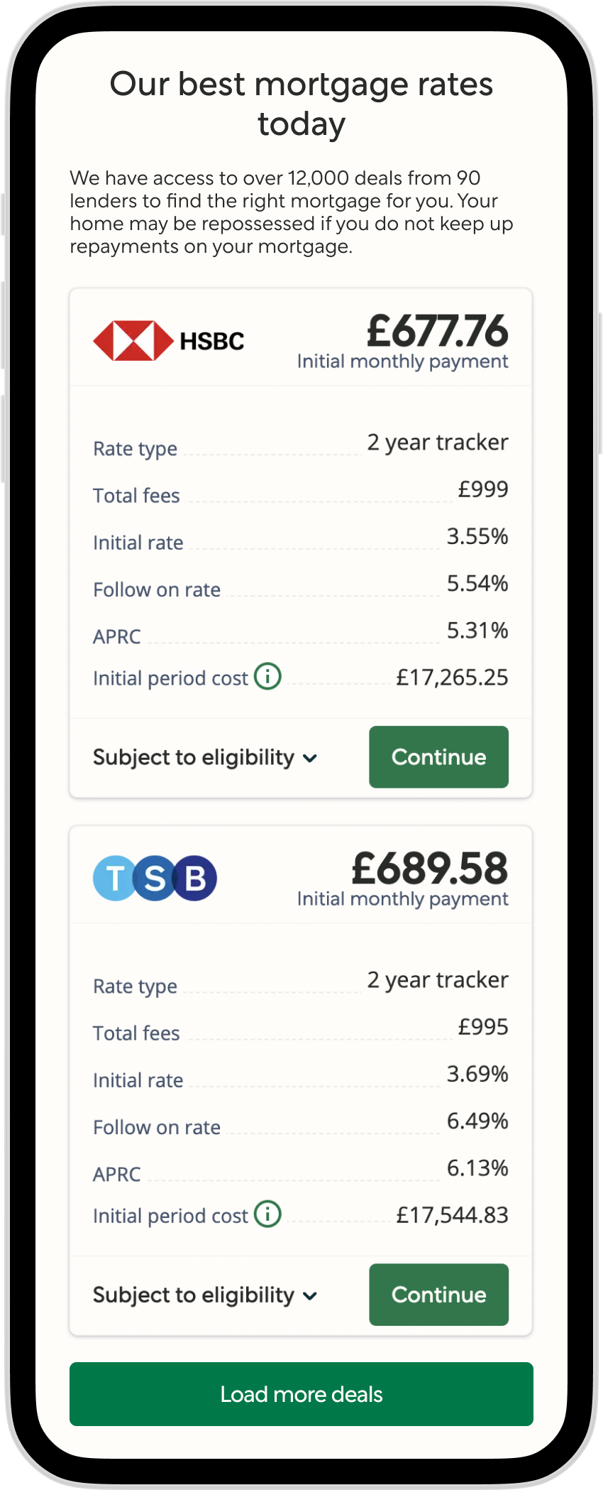
Better.co.uk (previously Trussle) is an online mortgage broker. Following its acquisition by Better.com, the business needed to rebrand the entire customer-facing product to align with the parent company.
The product had evolved organically over time. The 250-page website used components from four different libraries, with inconsistent patterns, accessibility gaps, and no shared design system. The rebrand wasn't just a reskin — it required auditing and rationalising the entire UI landscape.
The Constraint That Changed Everything
The original plan was a three-month rebrand timeline. Contractual obligations compressed this to four weeks. I was the sole design resource.
This constraint forced a decision: we couldn't audit, redesign and document everything. I had to prioritise ruthlessly — focusing on high-visibility areas, core interaction patterns, and components with the highest reuse potential.
Key Decision: System as Delivery Mechanism
Instead of treating the design system as something to build after the rebrand, I positioned it as the way we would deliver the rebrand.
Components were designed with reuse in mind from day one. Patterns were documented as they were created. The system wasn't a side deliverable — it became the mechanism for delivering at speed.
Rebuild rather than refactor
The existing component landscape was too fragmented to patch. A structured rebuild of core components allowed us to remove duplication at the source and establish consistent patterns from the start.
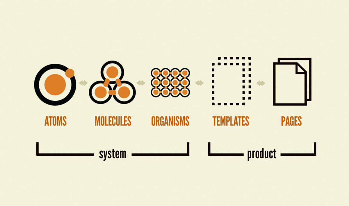
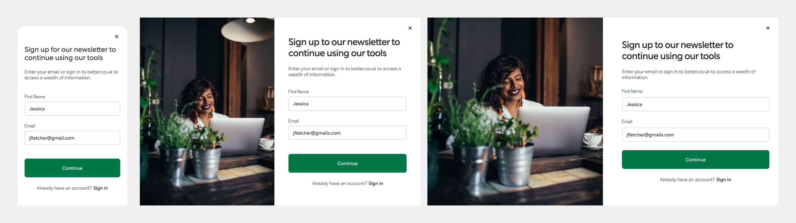
Atomic design principles
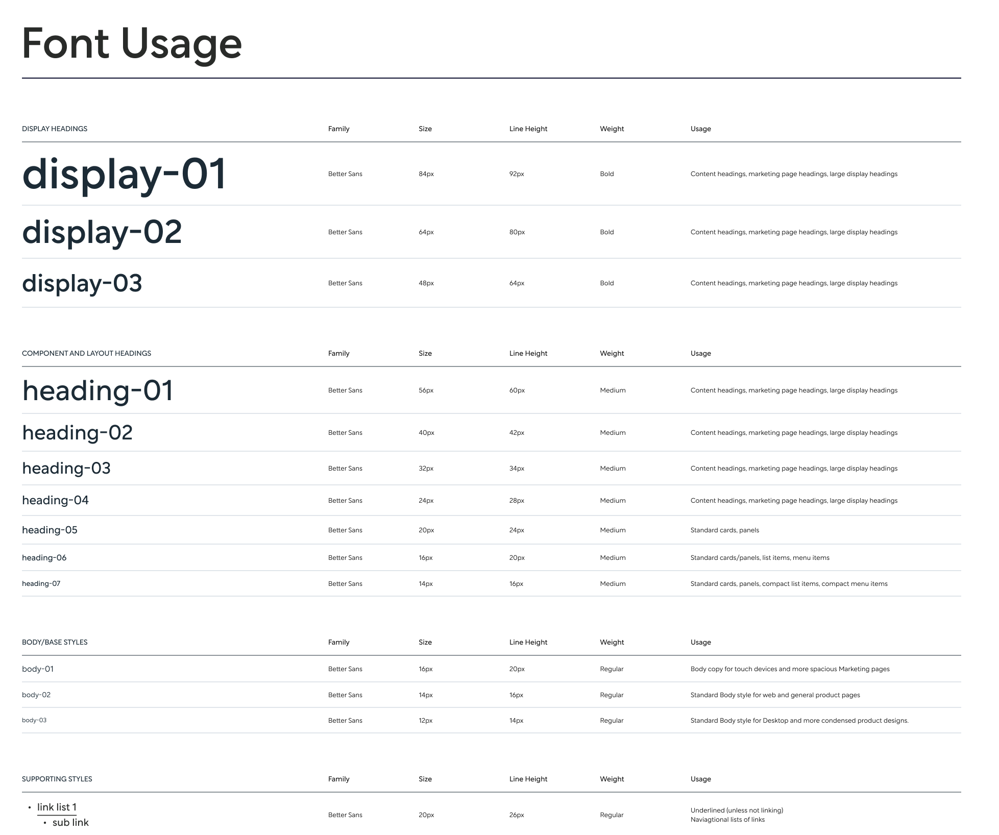
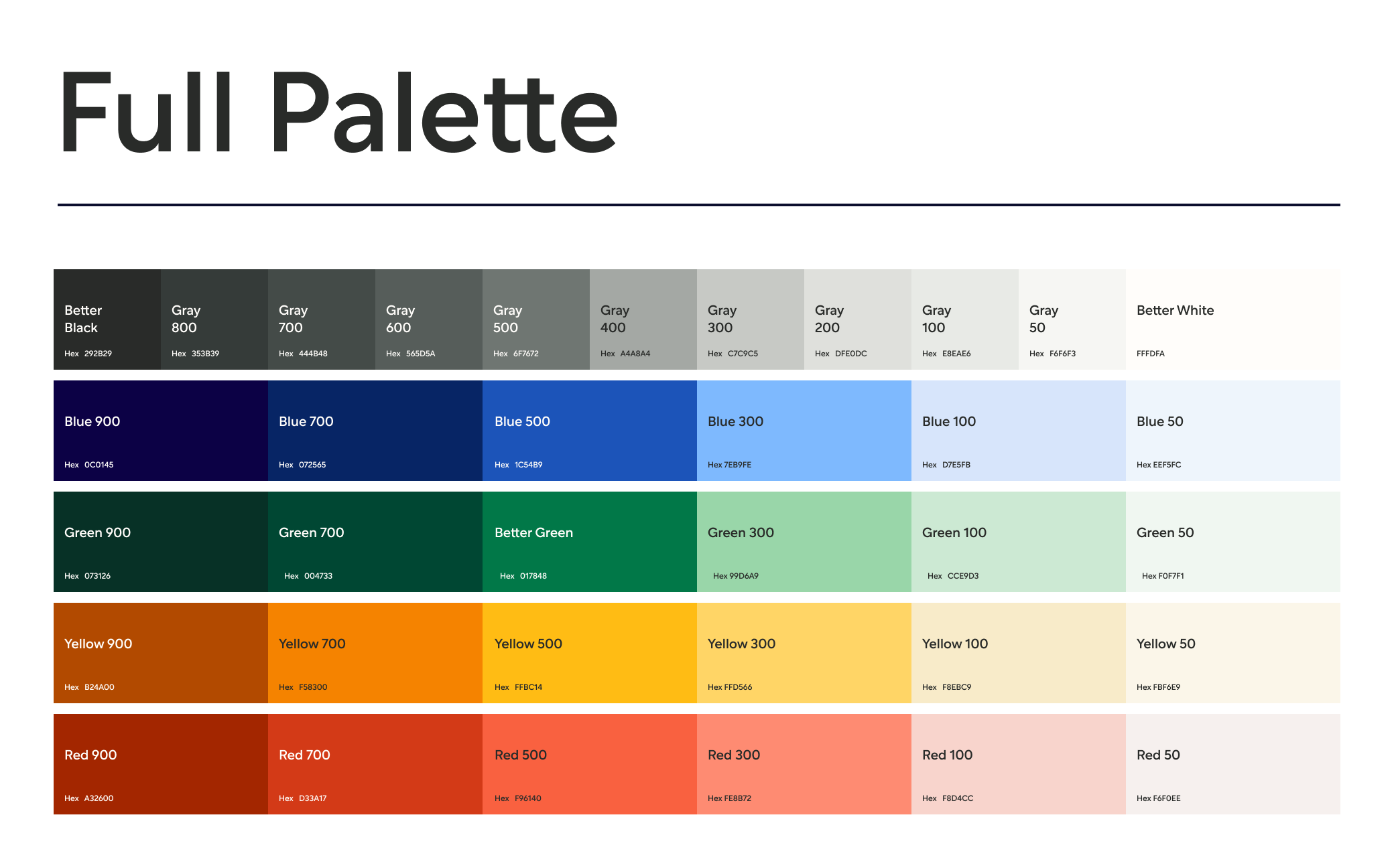
Built the new Figma system from atoms up, with consistent accessibility standards — colour contrast, labelled form fields, clear text hierarchy — documented in Storybook for engineering.
Prioritisation under pressure
Focused on high-visibility product areas, core interaction patterns, and components with the highest reuse potential. Everything else was documented for future iterations.
The User Testing Investment
Separately from the rebrand, I partnered with a product manager to assess the team's testing capabilities. I researched platforms, ran demonstrations, and presented a business case to senior stakeholders.
This resulted in significant investment and established a regular cadence of moderated and unmoderated testing — giving the team the ability to make product decisions based on insight rather than assumption.
Outcome
What This Demonstrates
- Delivery under extreme constraint — 4 weeks, solo, 250 pages. Reduced component duplication from 4 libraries to 1 unified system, cutting future design-to-dev handoff time significantly.
- Design system as delivery mechanism — the system wasn't built after the rebrand; it was how we shipped the rebrand. This approach enabled delivery in 4 weeks instead of the original 12-week plan.
- Secured investment in user testing — built the business case that resulted in tooling investment and a regular testing cadence, changing how the organisation made product decisions going forward.
- Built to survive my departure — the system, documentation, and Storybook integration I left behind continued to be used by the team after I moved on.