Gweek
First Design Hire at an AI Speech Intelligence Startup
Joined as Gweek's first designer, establishing the design function and introducing structured user research. Redesigned onboarding, sign-up flows and the AI-powered speech feedback experience to support the company's transition from B2B to B2C.
Context
Gweek is an AI-powered speech intelligence platform that analyses spoken communication and provides structured feedback. The product uses NLP to assess recordings, score performance, and guide users through progressive training levels.
When I joined, Gweek was focused on B2B — administrators would add users to programmes manually. The company was shifting to B2C, which meant the product needed to work for consumers arriving on their own. The onboarding, sign-up flow and feedback experience all needed to be rethought.
There was no design function, no user research practice, and no established design process. Part of my role was building those foundations while simultaneously redesigning the product.
Onboarding: From B2B to B2C
The existing onboarding required an administrator to create each user account — workable for B2B but a dead end for consumer acquisition.
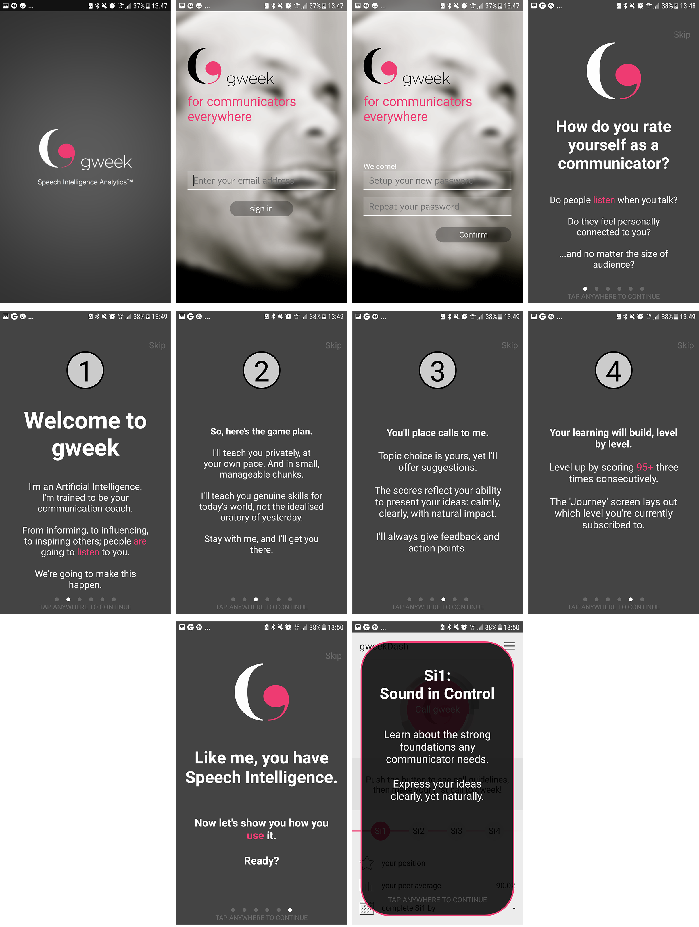
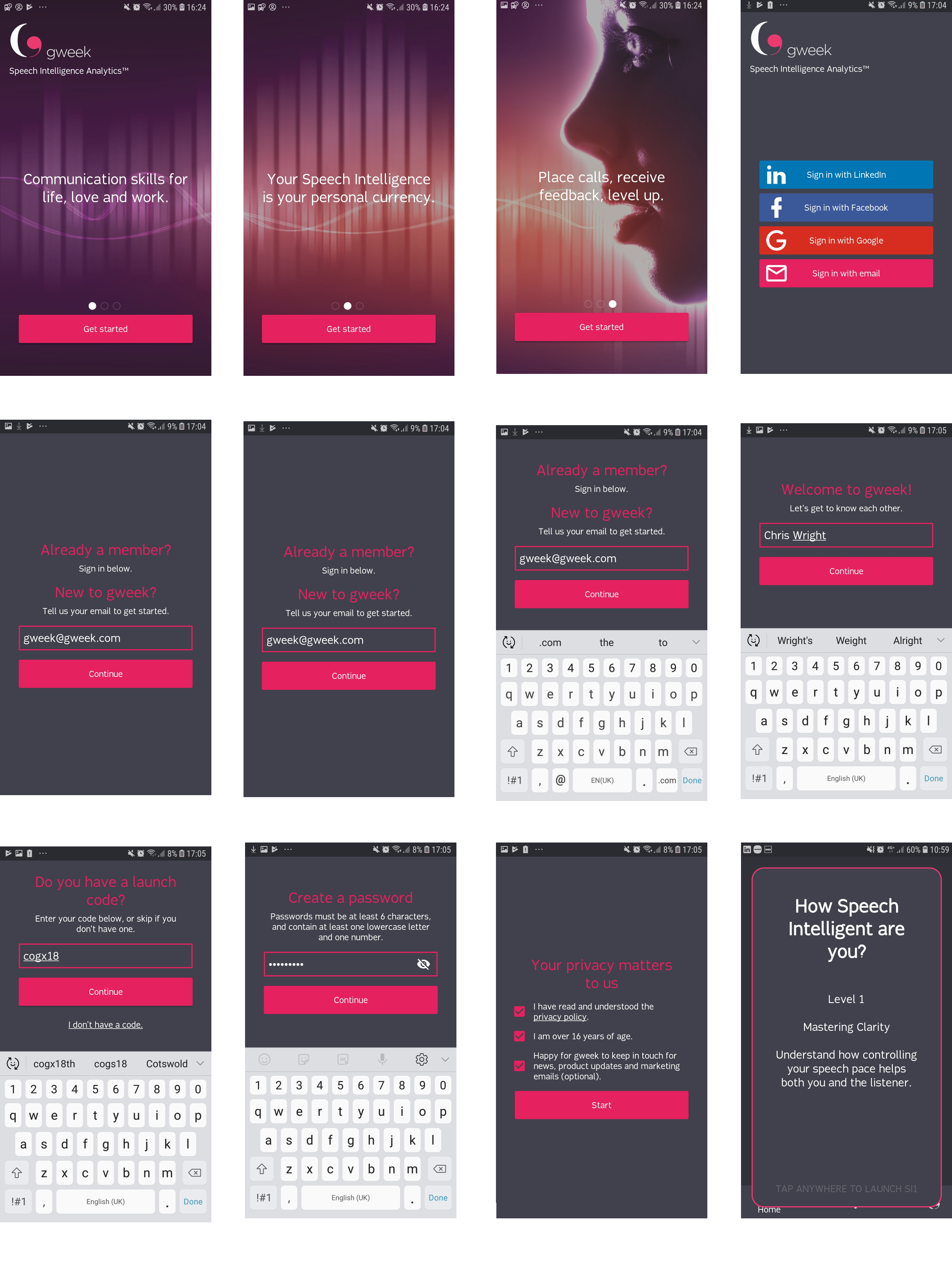
Simplified sign-up
Added email and social login options, removing the need for admin involvement entirely.
Value-first introduction
Replaced text-heavy introduction with three concise screens highlighting key benefits, getting users to their first interaction faster.
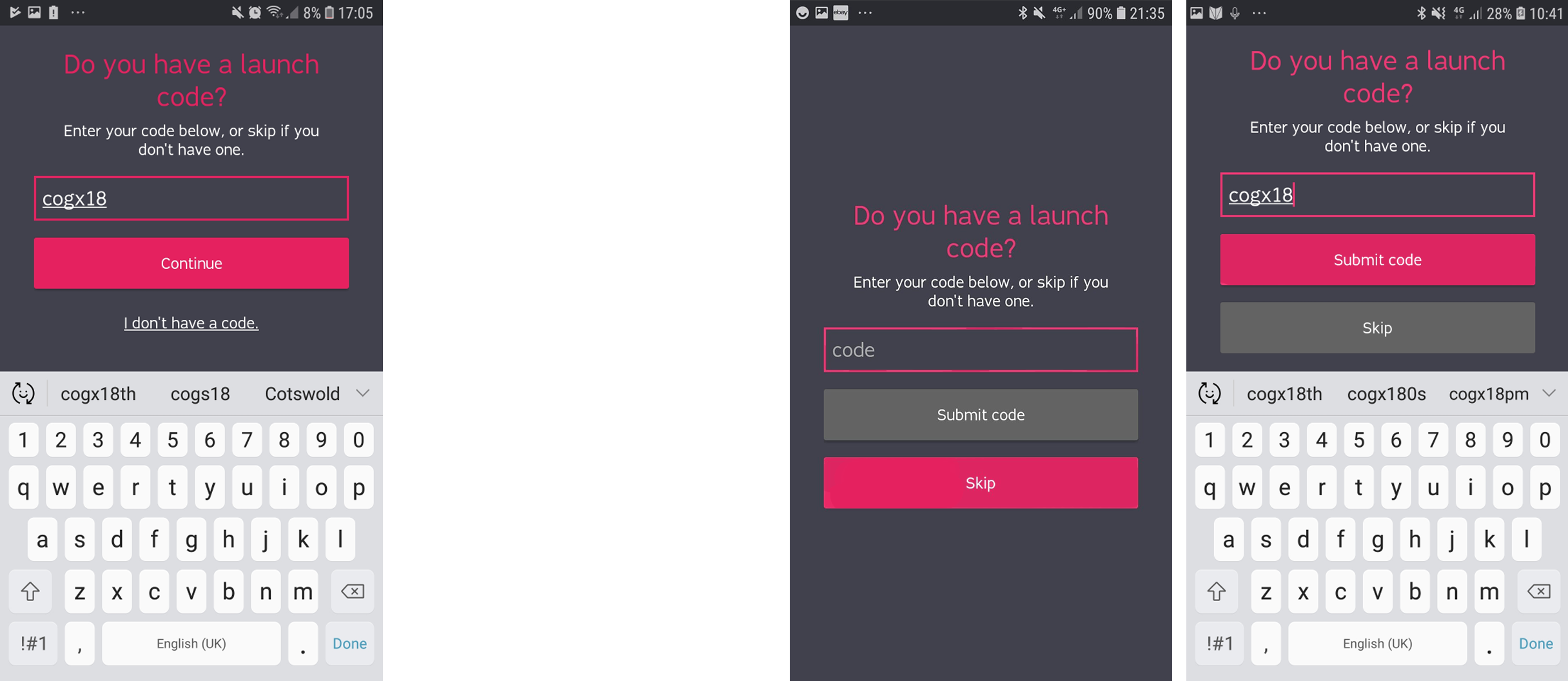
Promo code compromise
The launch code screen was causing significant drop-offs — users feared missing a discount and would abandon sign-up to search for codes. Worked with sales (who wanted to keep it) and engineering (limited time) to find the right balance: equally weighted buttons for "enter code" and "skip," with skip as the default.
Redesigning AI-Powered Feedback
The core product experience — the moment after a user submits a speech recording and receives AI-generated feedback.
The original design presented feedback as long blocks of text on the main dashboard. User observations showed people skimming past critical information like their suggested next topic or how many recordings they needed to progress.
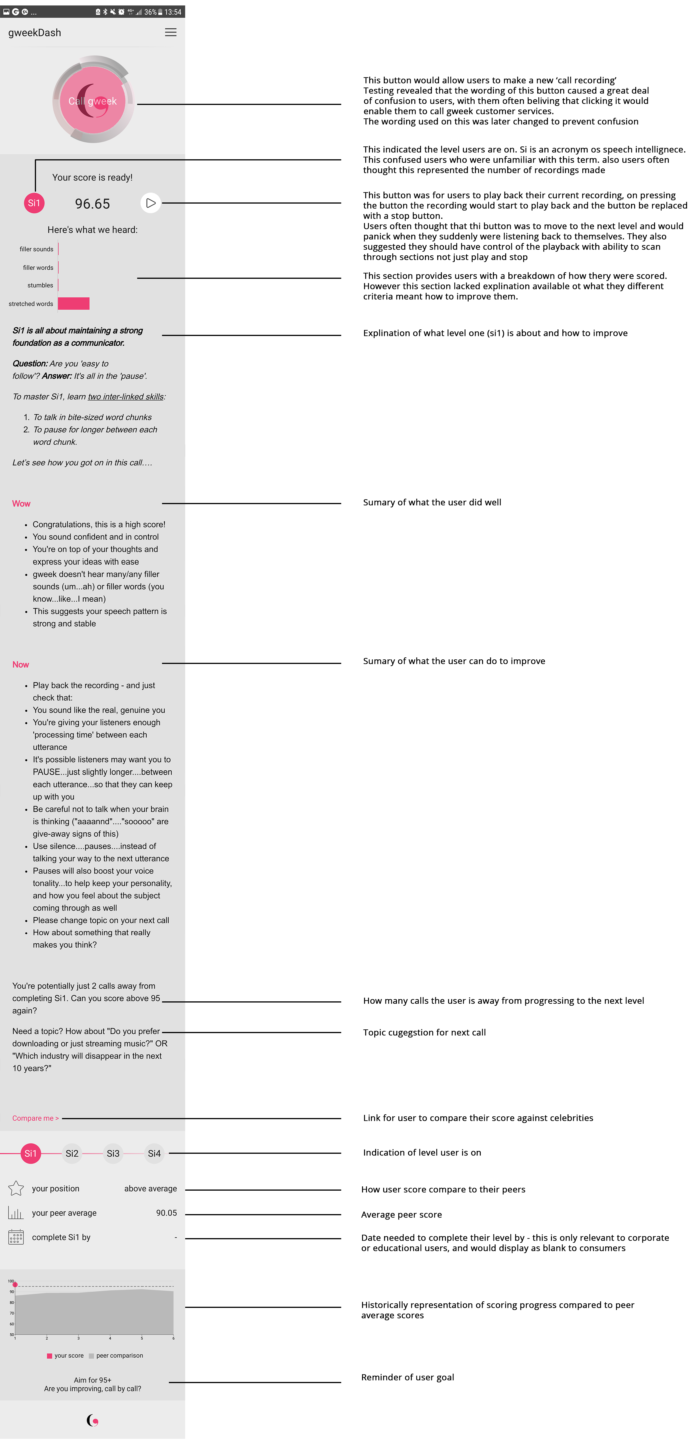
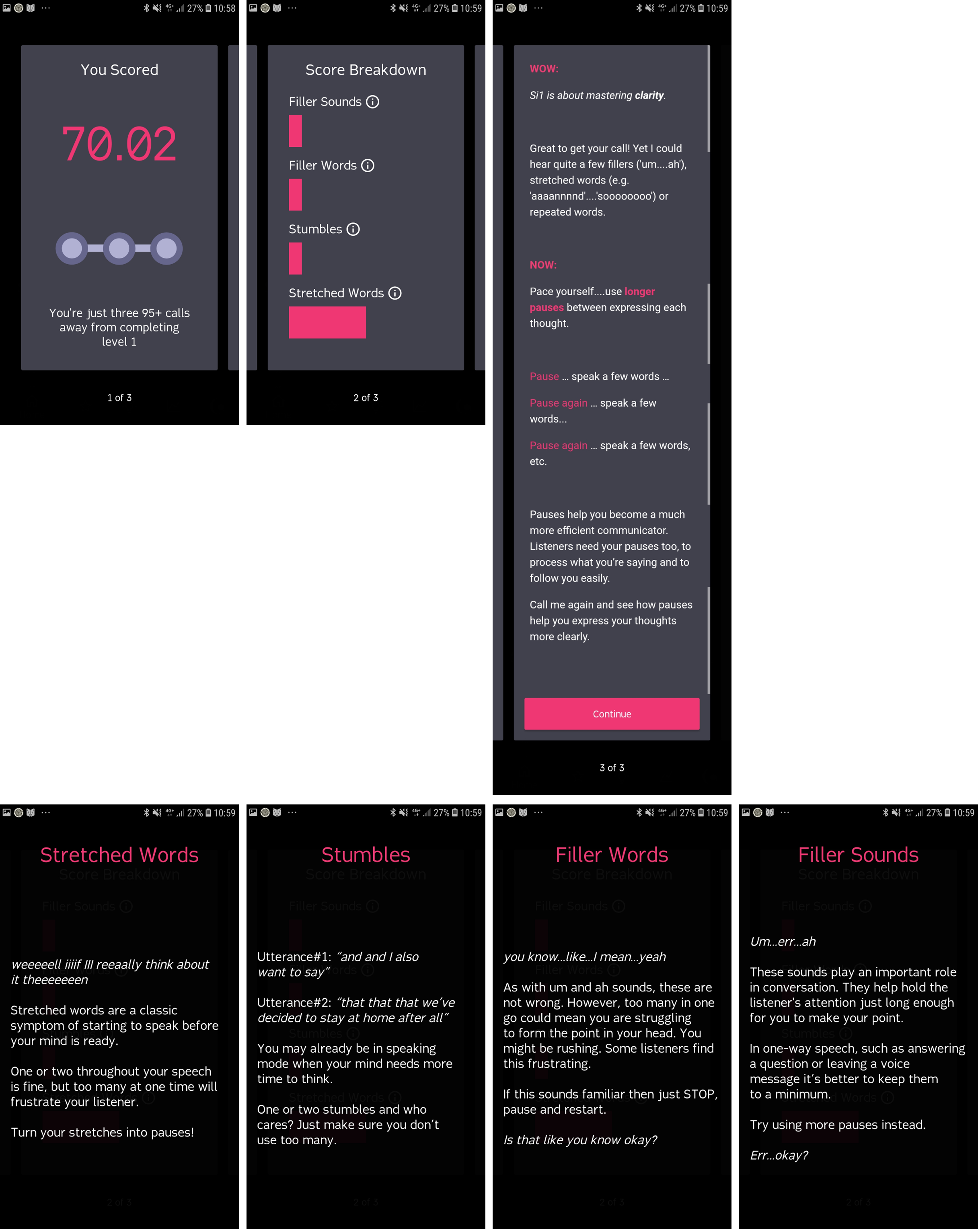
Dedicated screen so users focus on results without distraction
Graphical score breakdowns and clear streak position, making progress immediately visible
Clickable breakdowns for each area, with personalised strengths and improvement areas. Scannable at top level, deep on demand.
What This Demonstrates
- Building from zero — established the design function, research practice, and design process at a company that had none.
- Navigating stakeholder tension — the promo code redesign balanced sales needs, engineering constraints, and user behaviour evidence.
- AI product design — designing for AI-generated content (speech feedback) before it was a common design challenge.