Product Design – Web app

Digital Mortgage Broker
What is Better.co.uk
Design System Creation for Better.co.uk
The Challenge:
Following the acquisition of Trussle by Better, it was decided to rebrand Trussle to better.co.uk, creating a unified brand to leverage resources more effectively. Business constraints reduced the available time for the rebrand, making it essential to hand over usable, documented components to ensure a rapid development cycle.
We needed to:
- Audit the existing customer-facing website and mortgage journey.
- Restyle components to align with the parent company.
- Evaluate the usage of each component and assess whether it could be improved upon.
The Approach:
I collaborated closely with heads of product and development on this project. Initially, we had an incomplete style guide and components built with four different libraries. Our first challenge was to audit all existing components to understand their usage, importance, variants, and documentation status.
UX/UI Methodologies & Techniques:
UI Design: Created high-fidelity prototypes in Figma, focusing on a cohesive visual style and ensuring all components met modern design principles, and accessibiility guidelines.
QA of Implementation: Performed cross-browser testing, responsiveness checks, to ensure components functioned correctly.
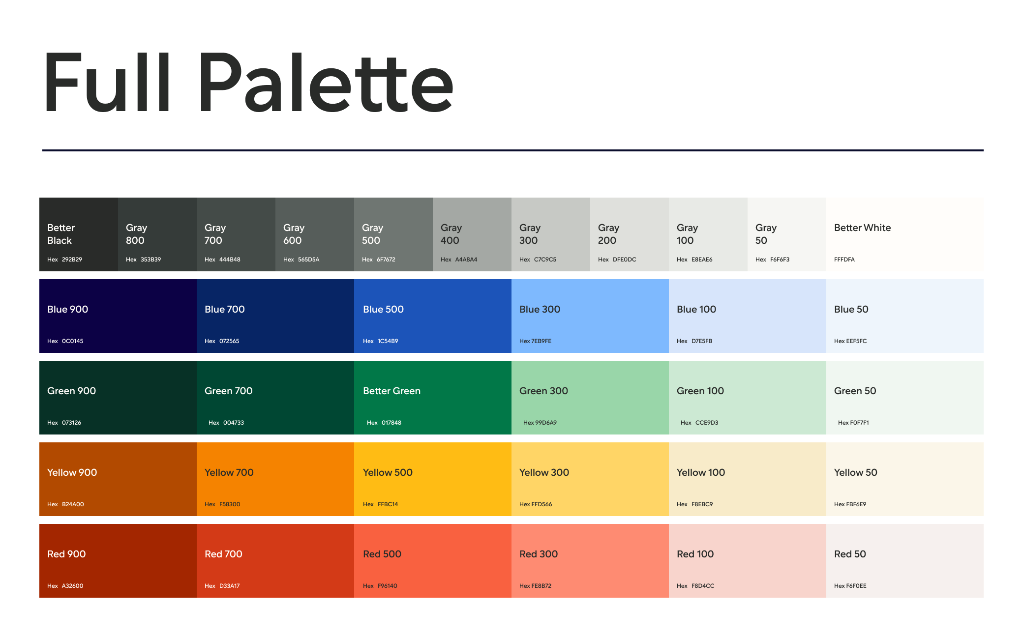
Style Guide: Developed a comprehensive style guide detailing typography, color schemes, spacing, and component usage to maintain visual consistency across the platform.
Pattern Library: Documented reusable design patterns in Storybook, providing a reference for designers and developers and facilitating faster design and development cycles.
UI Inventory: Conducted a thorough inventory of existing UI elements, identifying inconsistencies and redundancies to streamline and standardize components in the new design system.
UX Audit: Analyzed user flows and friction points through a detailed UX audit, informing the redesign to address previous shortcomings and enhance the user experience.
Atomic Design:
I Implemented an Atomic Design methodology,a methodology for creating scalable design systems by breaking down user interfaces into five levels:
- Atoms: Basic elements like buttons, input fields, and icons.
- Molecules: Groups of atoms forming simple components, such as a search form.
- Organisms: Complex components made of molecules and/or atoms, like a navigation bar.
- Templates: Page structures composed of organisms, serving as blueprints.
- Pages: Final designs, templates filled with real content.
This approach ensures consistency, reusability, and a cohesive user experience.

Accessibility in Design Systems:
Ensuring accessibility was crucial for creating inclusive user experiences, expanding our audience, complying with legal standards, and enhancing usability.
Our Approach:
- Evaluation: Conducted thorough assessments to identify and address accessibility issues.
- Inclusive Design Principles: Integrated accessibility guidelines from the outset to meet WCAG standards.
- Color Contrast: Selected color schemes with sufficient contrast for users with visual impairments.
- Meaningful Text Alternatives: Provided descriptive text alternatives for visual content to support screen readers.
- Text Hierarchy: Established a clear text hierarchy to improve readability and comprehension.
- Clearly Labeled Form Fields: Ensured all form fields were clearly labeled for better accessibility and user experience.
By integrating accessibility from the start, we created a more equitable digital environment, improved user satisfaction, and demonstrated social responsibility.


